GreenerU
An app that encourages university students to make more sustainable choices, through weekly challenges.
Context
We tackled the problem of apathy towards sustainability among university students.
As part of the Product Innovation Program (PIP) at Prodigi, our cross-functional team worked on this problem over 9 weeks to create a digital solution to unsustainable lifestyles on university campuses.
Details
Organisation: Prodigi
Role: UX/UI designer
Team: 2 UX/UI designers, 1 business analyst, 1 product manager. Our team was also mentored by a designer from Canva and a student instructor.
Duration: 9 weeks (March 2023 - May 2023)
The brief
Universities are one of the largest energy consumers, with buildings and transportation being the main sources of energy usage.
Create a digital product to encourage students to be more mindful of their environmental impact, and adopt environmentally friendly behaviours on campus.
The process
Research
We stepped into the footsteps of our fellow students.
I was tasked with user research as a UX/UI designer, while our BA and PM conducted competitor analysis and market research. They identified several solutions and competitors such as educational courses on sustainability, user demographic, and existing sustainability related facilities and policies across university campuses in Australia.
User survey
I was responsible for developing the survey questions. The aim of the survey was to gather a wide range of responses from the target demographic of students regarding:
- Sustainable living practices amongst university students and staff and understand how we can encourage more environmentally friendly behaviours and habits
- The universities’ ability to educate and promote sustainable living practices amongst students at university
Key findings: Our survey results revealed that almost 50% of respondents have an average awareness on sustainability-related issues and the majority of students believe their university has insufficiently educated them on sustainability.
User interviews
I conducted user interviews to gain a deeper qualitative insight into the following themes:
- The gap between knowledge and action
- Awareness vs. factual knowledge on environmental sustainability
- Does lack of knowledge inhibit their ability to take action?
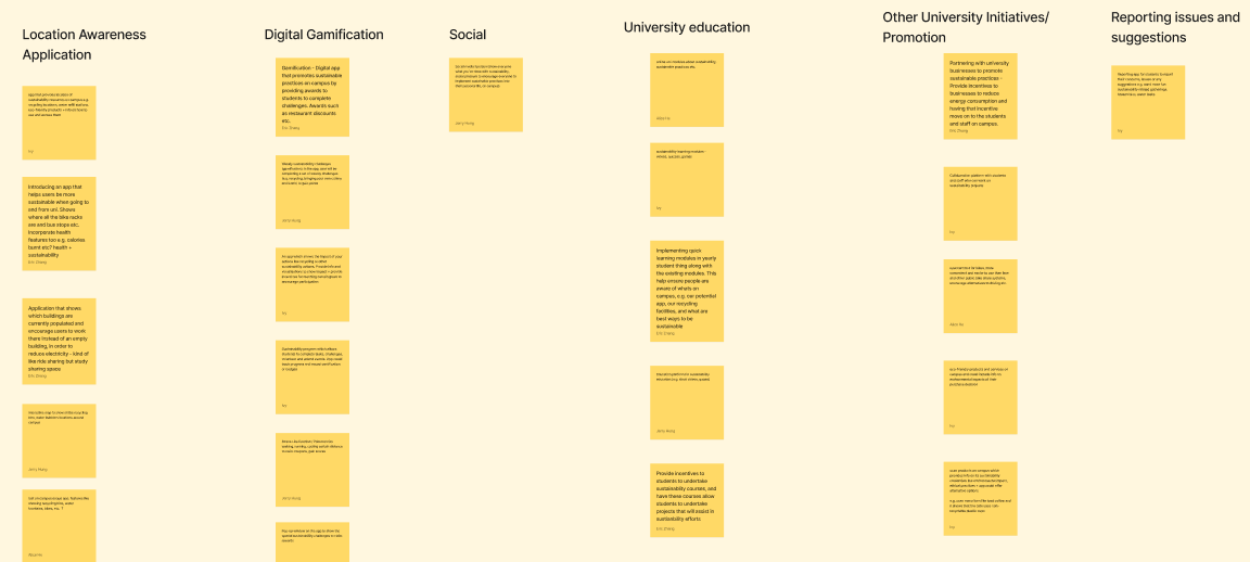
Affinity diagram
After collecting the recordings and transcribing the user interviews, I conducted affinity diagramming with my fellow designer to analyse the key data points. We grouped these problems under common themes and features on a FigJam.
The most substantial themes identified from the user interviews were:
- University education
- Visible sustainability on campus
- Sustainability community and engagement
- Personal practices
Synthesising insights
Students want to be sustainable, but they are held back by a lack of knowledge, confidence, and motivation.
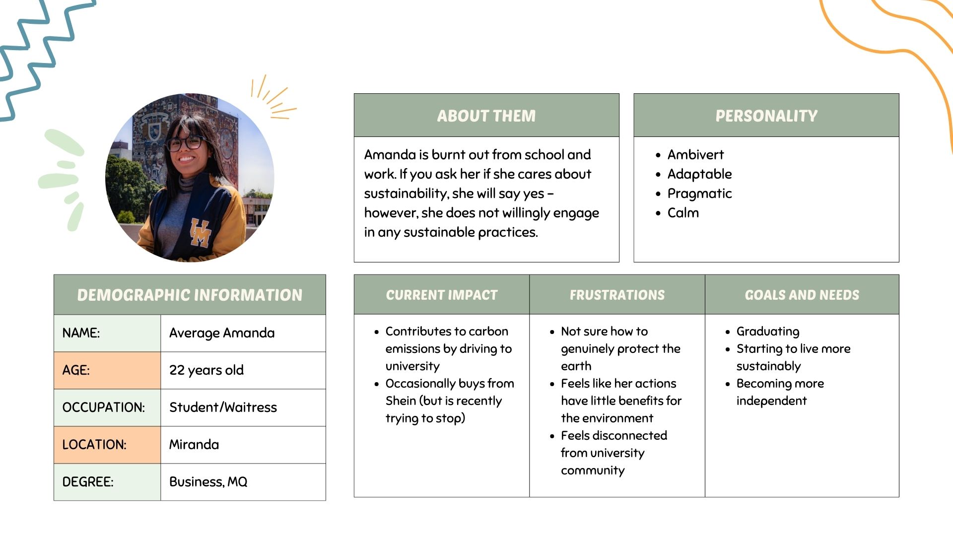
User persona
To help us frame our problem, three personas were created:
Conscious Clara, Just Jack, Average Amanda.
However, we ended up choosing Amanda as she represents the most common demographic from our research; a burnt-out student who is not opposed to living more sustainably, but doesn't know where to start.
With her busy schedule, she frequently buys lunch outside and believes that changing her actions will have little benefits for the environment. So, how might we encourage students like Amanda to be more mindful of their impact and share how small actions can make a big impact?
User journey map
To help visualise the experience of students using GreenerU, I created a user journey map with my fellow designer.
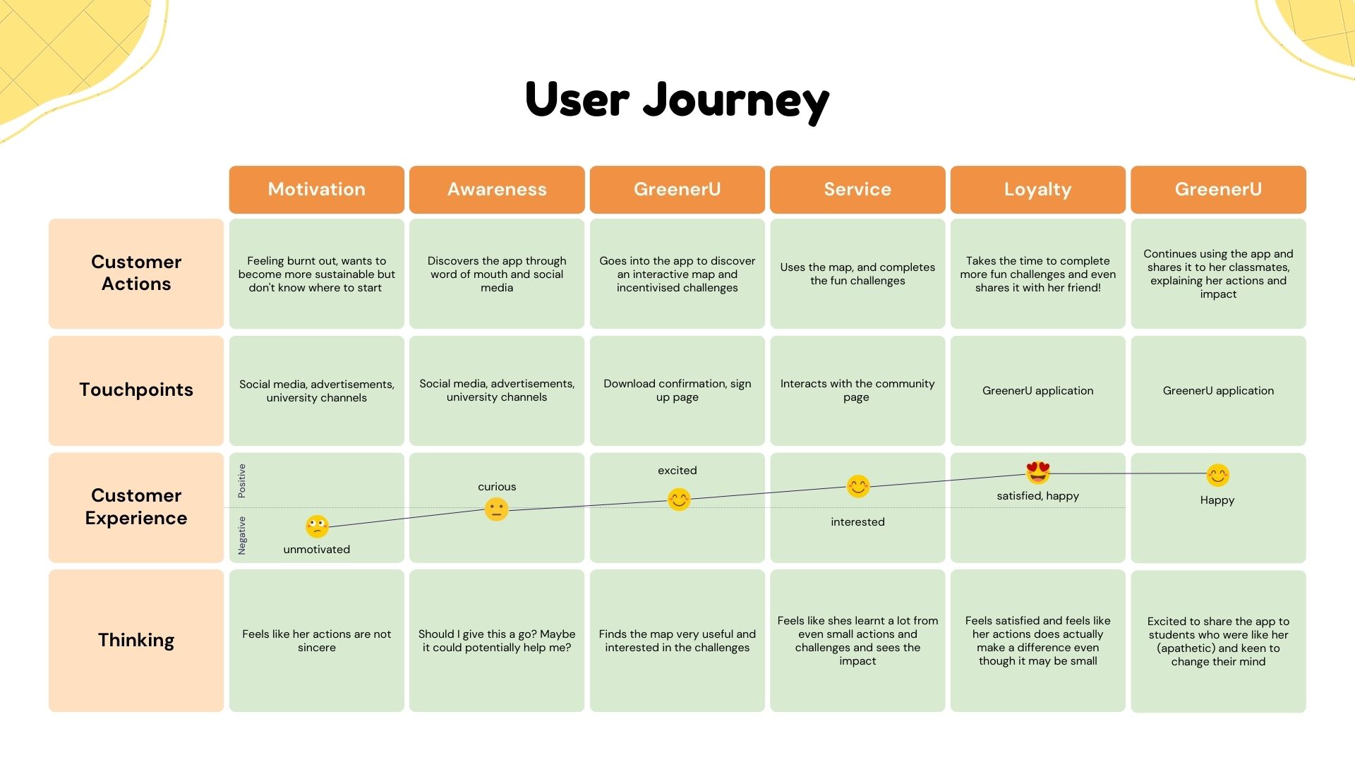
Pain points
With the help of these artefacts, we identified 3 key pain points. These were used to form our problem statement, and then guide our ideation.
- Uncertainty of one's actions
- Limited knowledge of sustainability
- Lack of motivation
Problem statement
Most students exhibit apathy towards their capacity to influence future environmental outcomes, resulting in reduced participation in sustainable practices and ultimately harming the environment.
How might we motivate apathetic students to be more sustainable?
Ideation
We decided to make sustainability fun for students.
Crazy 8's
Techniques such as brainstorming and Crazy 8s were utilised to quickly generate ideas. Our entire team engaged in the ideation exercise remotely, and organised it into an affinity diagram to identify similar ideas.
With the user persona, problem statement, and a how-might-we statement in mind, we settled on a gamification focus. This was a feature that each of us had suggested. The pain points were directly addressed through our features:
- Uncertainty of one's actions -> "One step at a time" challenges
- Limited knowledge on sustainability -> Interactive map and community page
- Lack of motivation -> Rewards and leaderboard
Prototyping
Designing a fun experience is fun for designers too.
Lo-fi sketches
With my fellow designer, we each sketched the initial low fidelity prototypes and received approval from our team, mentor and instructor. We then uploaded these sketches to Figma as references to begin mid fidelity prototyping. To ensure we designed consistently and accurately, we frequently communicated with each other and the team while prototyping.
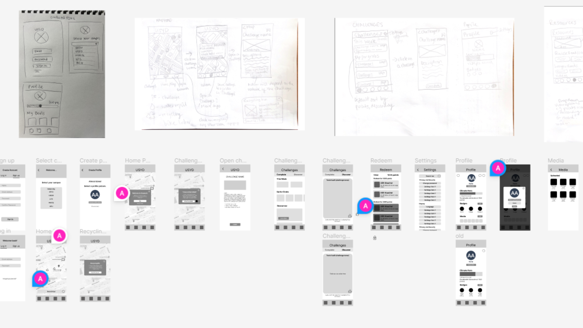
Hi-fi prototyping
Our team presented our mid fidelity designs and progress to the program leads. There were no significant issues regarding the designs. After discussing the feedback as a team, us designers went on to create our high- fidelity prototype, making decisions on visual guidelines and information architecture.
An important feature we left out in the mid-fi designs was the search bar, which we decided to place at the bottom in consideration of the thumb zone when designing for mobile users.
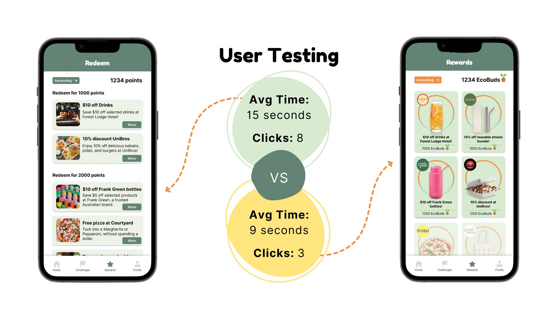
User testing
Users wanted to see more, all at once.
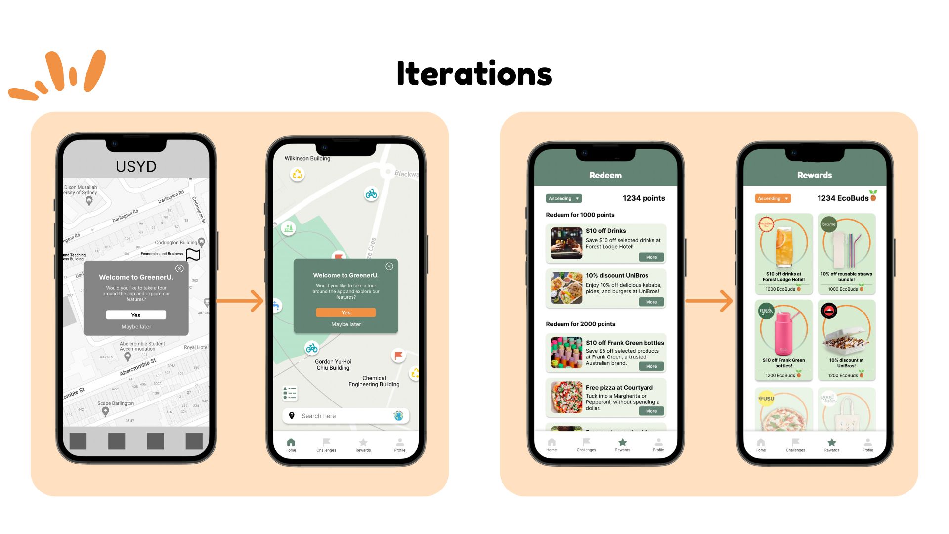
A/B testing
Each member of the team utilised a mix of remote and in-person testing to walk the test participant through the app. I was responsible for conducting A/B testing to evaluate the time and clicks taken to navigate from the Challenges page to redeeming a reward.
Findings
- Users took 6 seconds longer and 5 more clicks to complete the action with the row display, compared to the tile system. The tile system displays more rewards at once than the single rows, resulting in a shorter scroll time.
- The ‘More’ button added clicks as users assumed they were able to click anywhere on the box for further information.
- Users also found the tiles more aesthetic and spacious. As such, we decided to use this prototype version.
After testing on our high-fidelity prototype, we changed the layout of our rewards page with less text and cleaner visuals as well as replacing points with EcoBuds to make it more playful and fun.
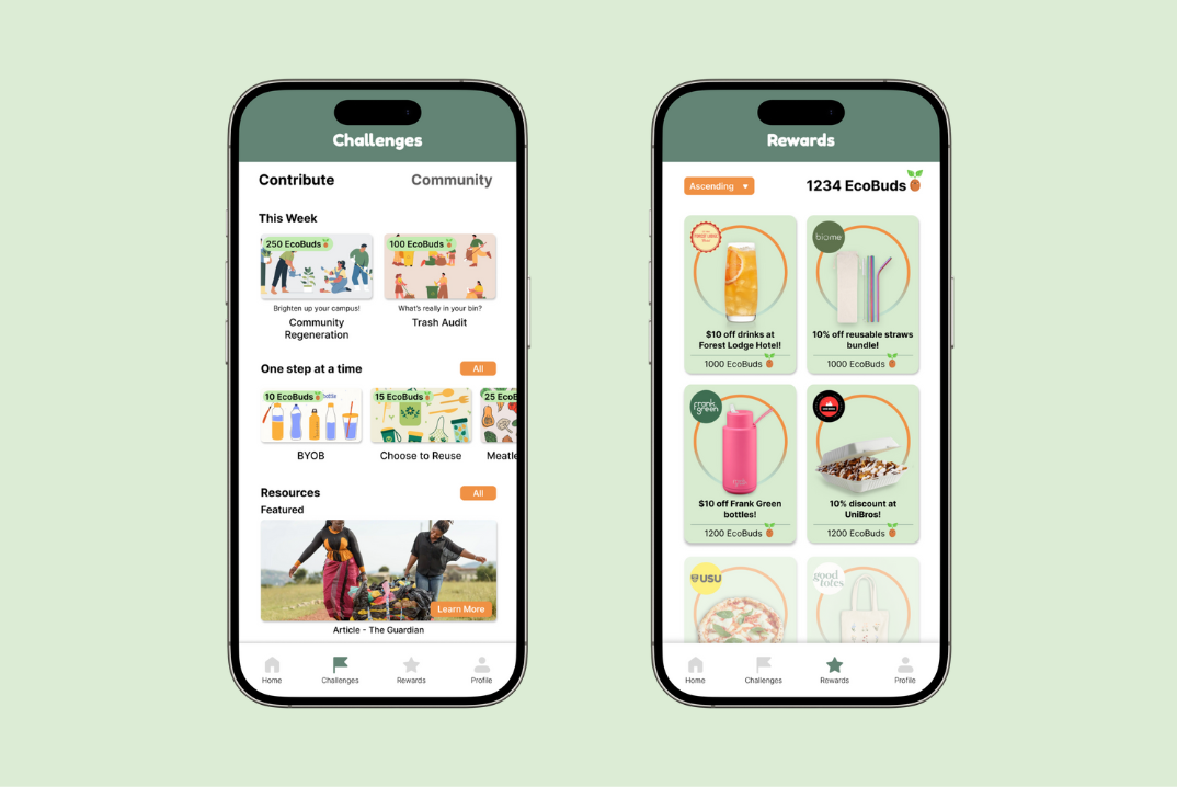
Hi-fi protoype
Take a small step towards becoming a GreenerU!
GreenerU is a digital solution that addresses the gap between knowledge and action in regards to sustainability. Through interactive campus maps, incentivised challenges and community pages, GreenerU encourages gradual behaviour change, empowering individuals to take proactive steps towards environmental sustainability.
Features
- Home/Interactive Map: map highlights nearby facilities e.g. recycling bins and water refill stations, as well as challenges based by location.
- Challenges: 'Contribute' section displays all available challenges to complete to users, as well as a 'Resources' section that provides articles, literature, etc. to educate users on sustainability. 'Community' section was inspired by the social media app BeReal format, allows users to post about their progress and also has a leaderboard section.
- Rewards: displays all rewards available to users based on their amount of points (EcoBuds).
- Profile: displays user information, progress bar of EcoBuds collected, badges collection.
Product demo
Reflection
Design is really powerful.
I learnt an incredible amount from working within this cross-functional team. As this was the first time I collaborated on a product design project, it was extremely rewarding and valuable to create a digital solution from start to end. In addition to improving my creative thinking, problem solving, and design skills, I became truly confident in the power of design to address a global challenge as complex as climate change, and its power in influencing people's behaviours for a better future.
Future iterations
Our team’s project was placed 1st, and I believe we successfully addressed the design brief. However, there were still various features and facets of our solution which we wish we could have included or tweaked.
How might we keep users accountable when completing challenges?
- Challenge Approval: a community based feature in which users may 'thumbs up' or 'thumbs down' a post. A challenge post is only approved via thumbs up. This prevents the issue of cheating.
- Forum/Discover: a page which scrolls through randomised photos from other users for you to approve, utilising the Challenge Approval feature.
How might we personalise the user experience and keep users engaged?
- Personalised recommendations: provide personalised recommendations for challenges and activities that align with Amanda's values. These recommendations are tailored to her preferences, making it easier for her to get started.
- Friends: connect with your friends, allows users to show off their progress and badges.
- Continually partner with additional companies to provide users with more incentives and options for rewards