Email controls in AdminHub
Redesigned the email controls experience in Atlassian AdminHub to better align with data privacy controls.
Context
As an intern, I empowered customers by providing greater controls over their data.
I contributed to the Cloud Readiness team and worked heavily within the space of data privacy controls.
Details
Company: Atlassian
Role: Product Design Intern
Duration: 12 weeks (November 2024 - February 2025)
The brief
This was initially daunting but I ended up enjoying the flexibility of this project!
How might we connect the emails experience to data privacy controls?
The brief was quite broad, providing me with a great deal of autonomy and freedom. The current email controls experience is disconnected from other work regarding controls for user-generated content. How might we connect these workspaces?
The process
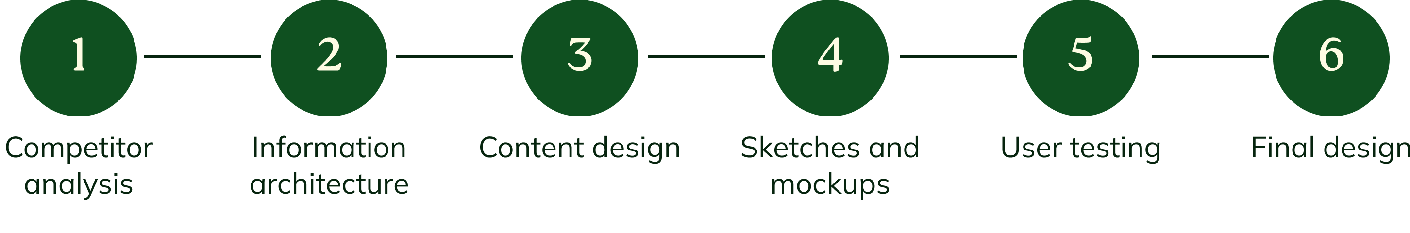
Research
I began learning as much as possible about the problem space and product.
There was an influx of information at the start of the internship, which included reviewing existing artefacts, documents, and work in the UGC space.
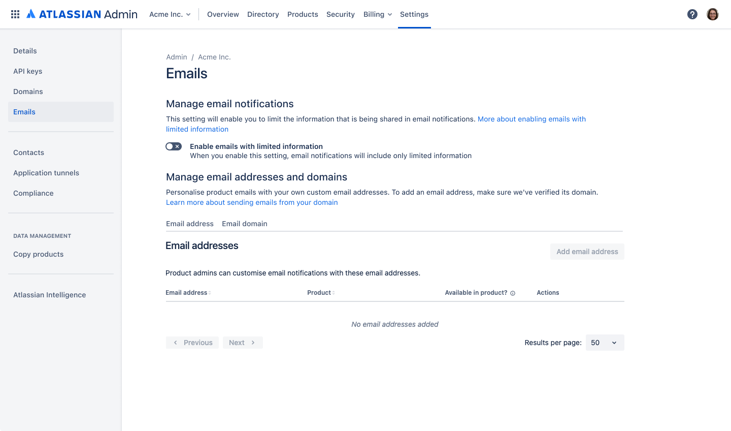
Design audit
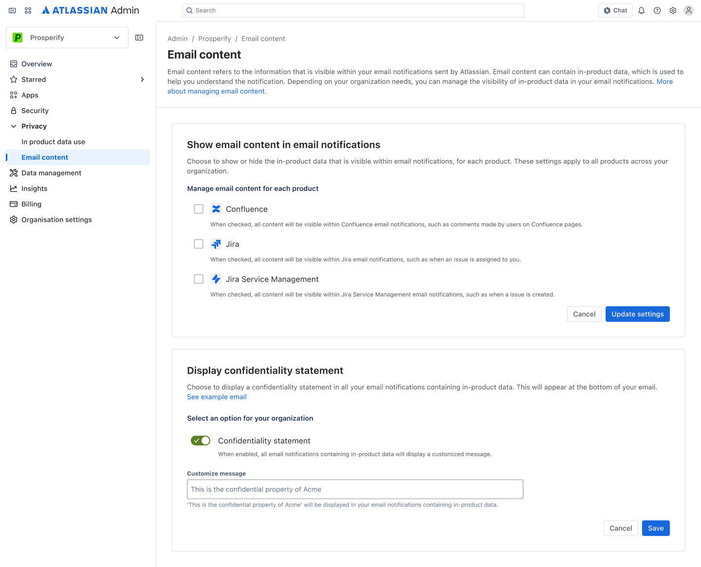
The existing email experience consists of a toggle that allows customers to show or omit sensitive data in their emails, otherwise known as user generated content (UGC). Users may also customise email domains in this space.
After an analysis of aspects such as content, touchpoints, and overall user journey, I identified 3 key concerns:
- Lack of adequate content: I was left with many questions, e.g. which emails are impacted by this feature, what is limited information, what exactly am I controlling here?
- Lack of security with the toggle: toggling on and off results in an instant effect, however should this be the case when controlling sensitive data?
- Crowded visual display: the narrow spacing and weak visual hierarchy was overwhelming, slowing down my processing of information and location of touchpoints
Competitor analysis
I analysed the email controls in 4 competitors:
- Asana
- Monday.com
- Notion
- Clickup
2 Atlassian products were also analysed:
- Jira Service Management
- Confluence
I collected quantitative metrics: how long it took to locate the email controls were used, and the number of steps taken to complete the task.
I also gathered qualitative data which consisted of: look and feel of the interface, ease of use.
I identified that the top competitors had 3 distinct qualities:
- Provides both simple and advanced controls: users are given greater choice and freedom, contributing trust in the platform
- Open display: it was easy to view and access everything at once, there weren’t an unnecessary amount of touchpoints
- Strong visual hierarchy: I could easily identify sections and categories, and find what I wanted
Synthesising insights
The lack of dedicated research to this space made it more difficult to draw insights, so I found it useful to hypothesise the problem first.
The problem began to look clearer through the lens of the user.
Due to the large overlap in problem space between my project and the UGC work, I utilised existing artefacts such as the user persona and user journey map. However, I created my own problem statement to reflect the differences.
Problem statement
Enterprise customers consider email to be an insecure medium for sensitive data. Maintaining customer trust is a significant priority for Atlassian, but using email to share sensitive data erodes this work. Enterprise customers also require greater control over how their data is shared to meet increasing governance needs.
Providing admins with adequate control over their data sharing preferences will increase their trust in the Atlassian platform, and subsequently help them meet organisational expectations. This work will aim to maintain customer trust by providing admins with greater control over the content being shared within email notifications.
We will increase customer trust by providing them with greater controls, which in turn better supports their role.
Ideation
This phase took longer than I intended to, and it felt like I wasn't making any progress. I had to remember that the design process is iterative!
I went back to basics.
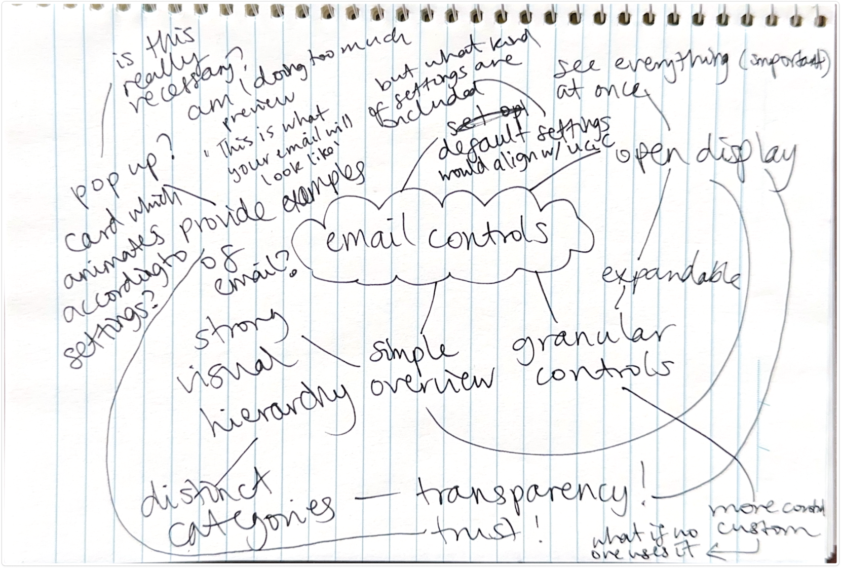
With the problem statement in mind, I began writing down every idea I had on classic pen and paper. Beginning with brainstorms, then moving onto sketches to visualise my ideas.
Brainstorms and sketches
Many, many, many sketches and brainstorms were made (not all pictured).
I took a step back and looked at the bigger picture.
Information architecture
After comparing and analysing the features offered by email content and email domain controls, I made the decision to separate the two areas.
This was due to the function of each control. Email content controls directly provides the user with greater privacy, similar to the UGC workspace. Email domain controls however, only allows the user to change the sender email address, i.e. appearance In order to align with UGC controls, it would make sense to separate these two aspects of email controls.
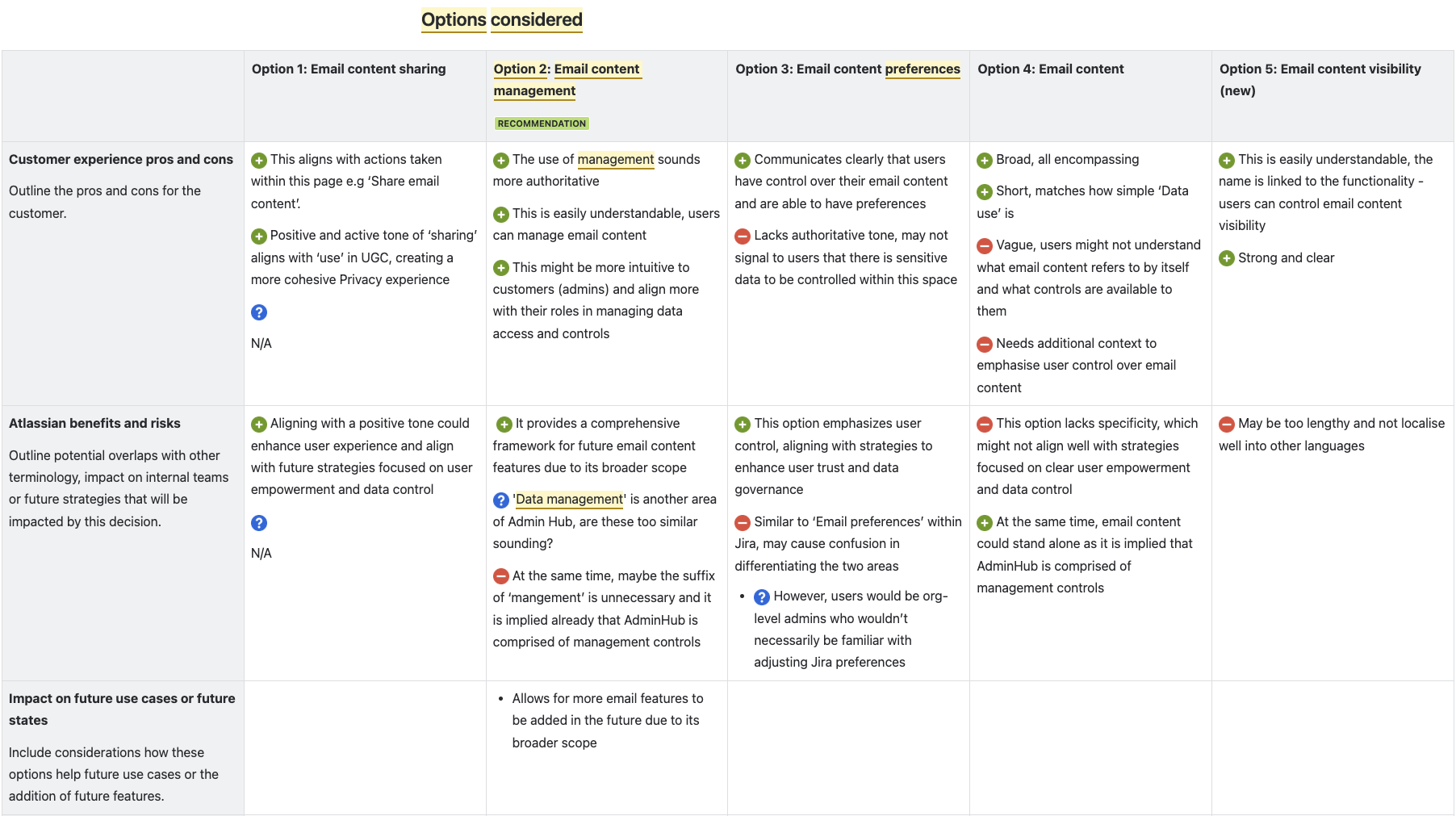
Content design
I also engaged in some content design work, providing several naming options which I took to my team’s weekly design crit, as well as our interns’ design crit. I considered the impact of these options on localisation, future use cases, customer experience, and more.
Product designers, content designers and product managers were all consulted to ensure a comprehensive review of options.
Key decision: 'Email content' was chosen due to its flexibility and short length, allowing for more future use cases and easy localisation for different languages. My decision matrix reached senior engineering teams, which believed this was a great direction towards centralising email content in Atlassian products.
Prototyping
Getting used to a new design system is almost like learning a new language.
I utilised the Atlassian Design System and design frameworks to explore my ideas.
Using a design system for the first time was initially challenging, but eventually it became second nature. With the guidance of Atlassian's design processes and principles, I was able to quickly visualise my concepts.
Early explorations
Initially, I thought of providing users with 4 presets. However, I struggled to map each of these options to UGC, so I scrapped it. I also had the idea of an email preview that would dynamically update to reflect the user’s option, however this later turned out to be not feasible or scalable.
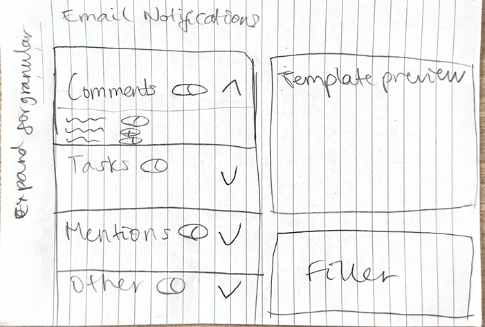
30% designs
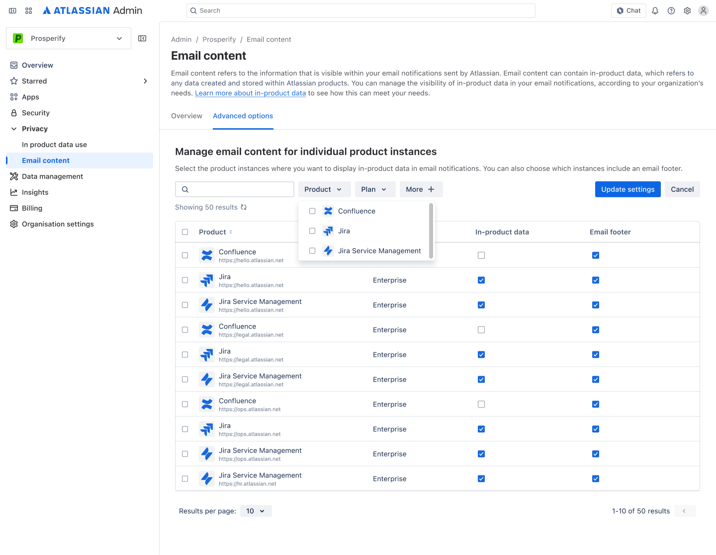
After reworking my concepts and incorporating feedback, I landed on these controls that enabled users to configure based on product, organisation wide. This was done to primarily align with similar features offered for regulated industries i.e. HIPAA.
I also incorporated a customer request to display a confidentiality statement within a short timeframe. This allows users to add and customise a disclaimer at the bottom of their emails.
60% designs
After bringing my designs to our weekly team crit, design intern crit, product manager and senior engineers, I iterated based on the main pieces of feedback:
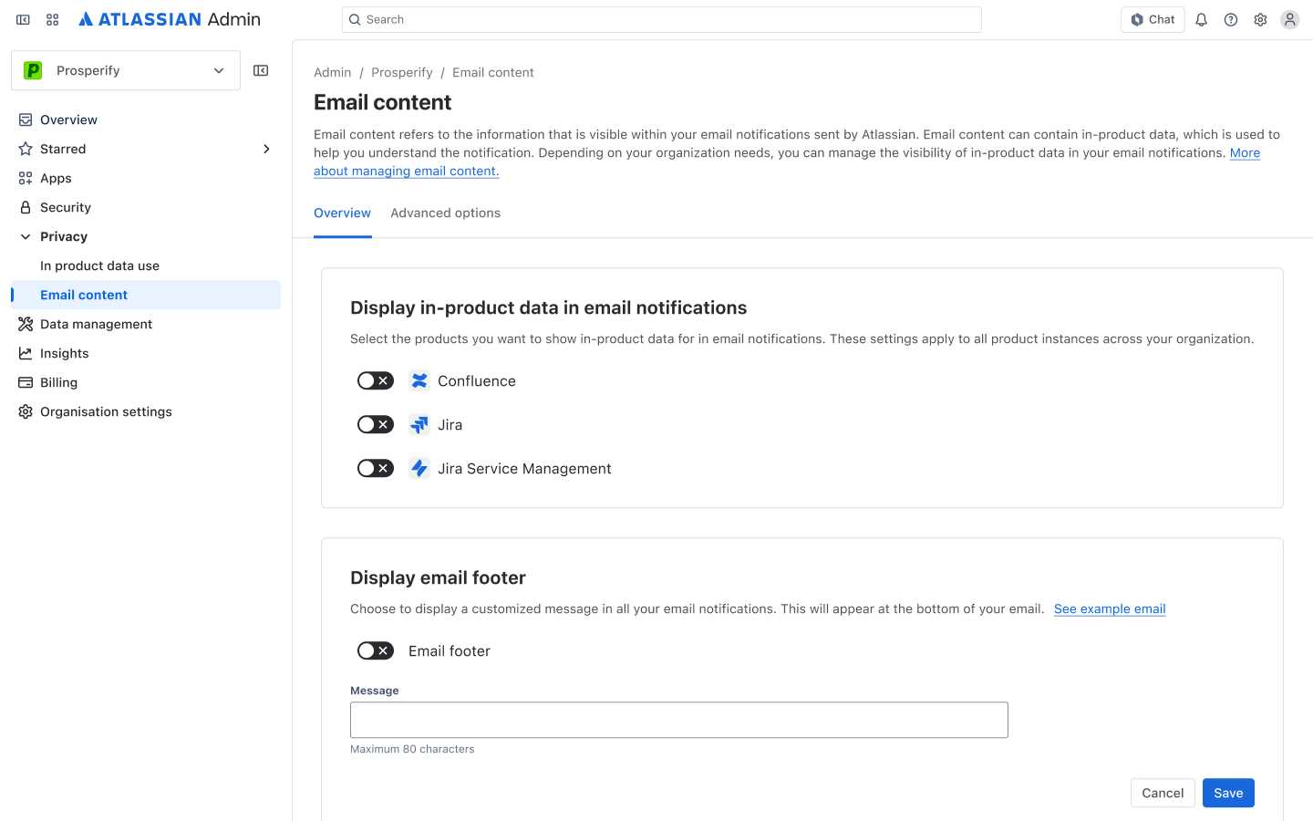
- The confidentiality statement feature seemed disconnected from the email content feature
- To make the use case more flexible, the confidentiality statement should be renamed to 'Email footer'
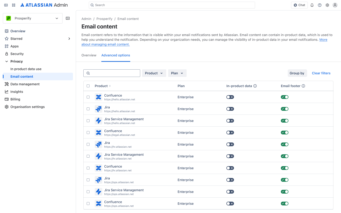
- Provide more granular controls by allowing users to control data per product instance. This would also align with UGC controls.

User testing
Though my intern self hoped to conduct customer interviews, this is not almost possible when designing enterprise.
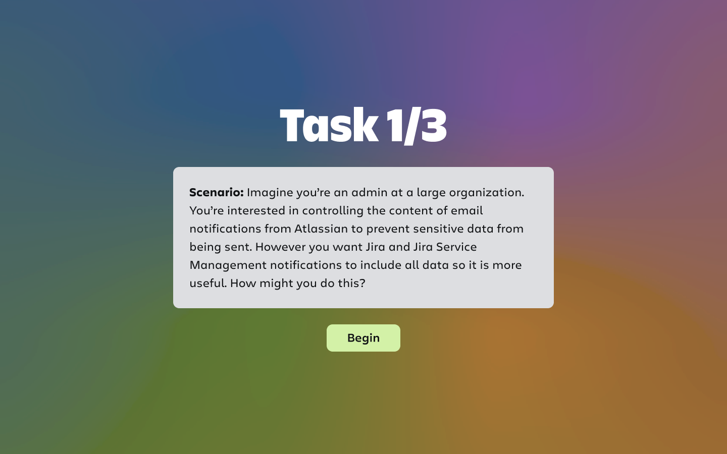
I conducted SEQ testing to identify usability issues.
I conducted SEQ testing on 5 internal participants to identify usability issues. Each participant was given 3 tasks to complete on a basic Figma prototype:
1. Adjust settings to show in-product data for Jira and Jira Service Management
2. Turn on and customise email footer
3. Adjust settings to show in-product data and email footer for a specific Confluence instance
The SEQ prototype I created provided the participant with a scenario at the start of each task and was linked to the relevant screen, allowing for a smooth testing session.
Findings
It's always interesting to receive feedback, because you never would have thought of it yourself.
I discovered issues around a lack of system feedback and consistency.
Affinity grouping
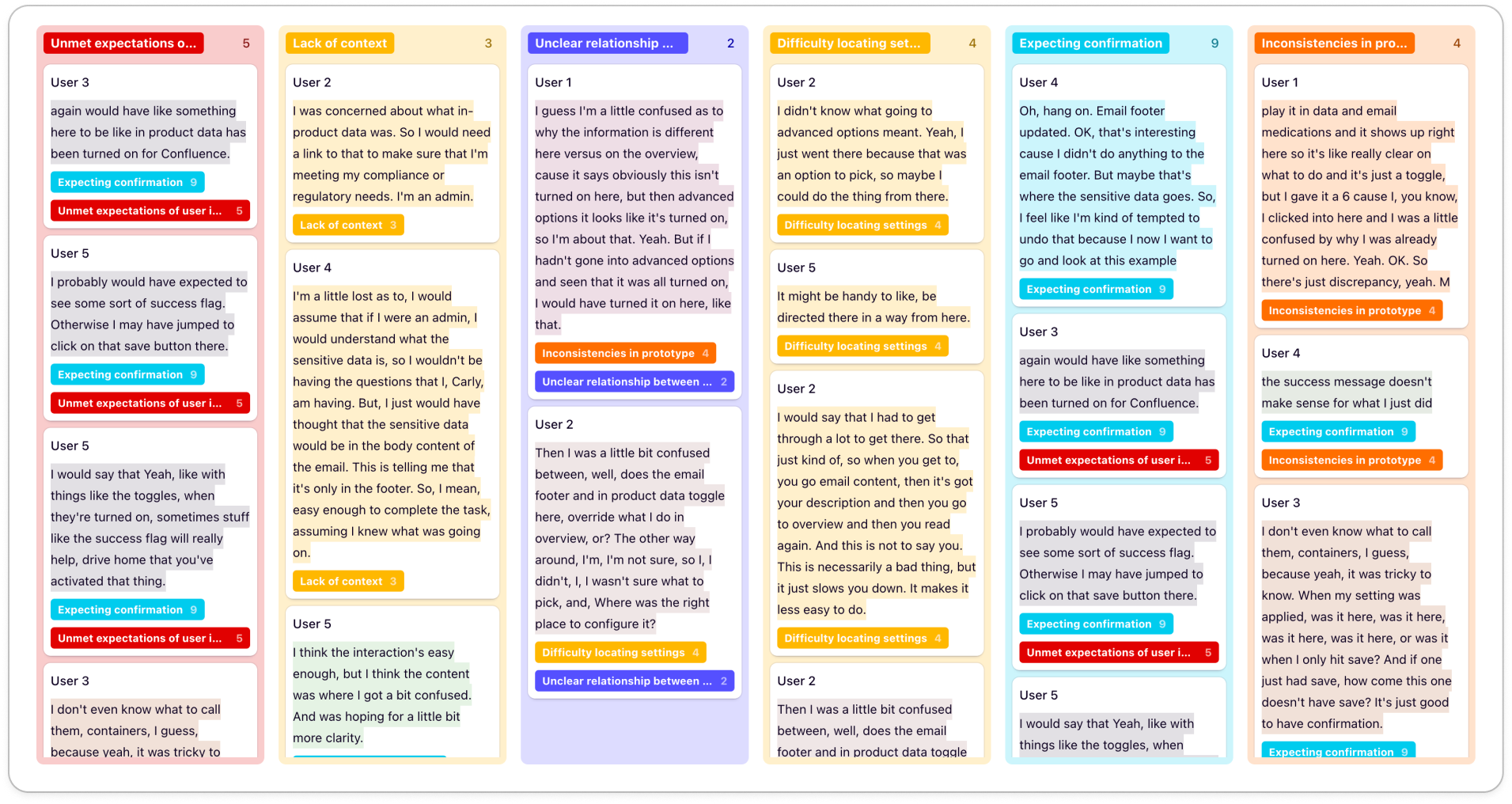
Using Dovetail, I highlighted quotes from the transcripts and sorted them into common themes. The most significant usability issues were:
- Users expected success flags once they adjusted in-product data settings, but didn't receive it
- Users expected to manually save their in-product data settings, leading to them pressing the 'Update' button for the email footer
- Inconsistencies in the prototype confused users, resulting in errors
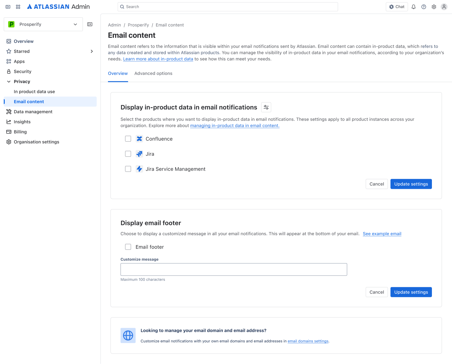
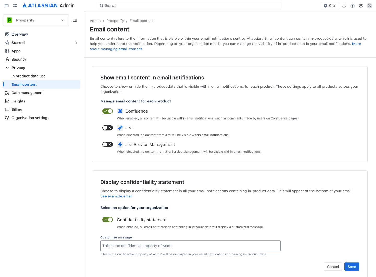
Final design
After weeks of research, meetings, feedback cycles, and many hours staring at Figma, I produced an email content controls experience for enterprise users.
After addressing feedback, I reached my final design.
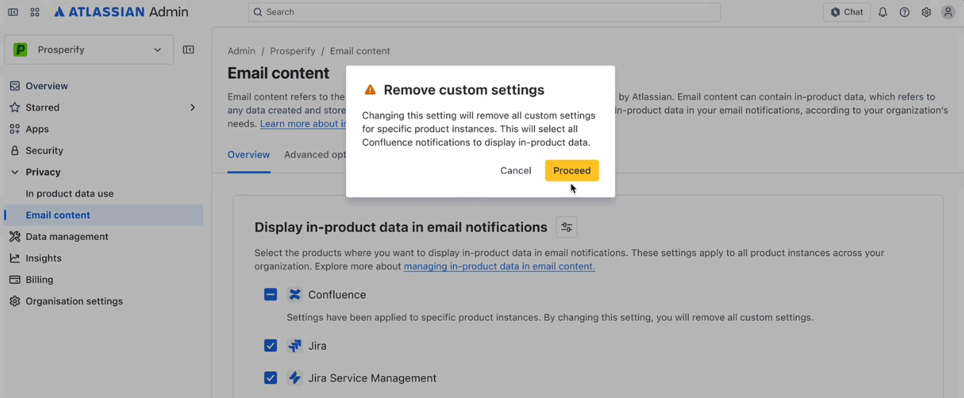
After addressing the feedback from user testing, I reached my final design. The main changes were:
- Checkboxes and manual save instead of toggle: users wanted to click save, but did not have the option to.
- Manual save increases the user’s feeling of security and trust in their actions, and the interface.
- Consistent success flags
How did this solve the problem?
Impact
The user is now empowered by Atlassian AdminHub and trusts the platform.
By providing admin users with greater control and flexibility over their data sharing preferences, we succeed in increasing trust in Atlassian’s platform, and supporting their role to carry out their necessary duties.
Reflection
The design process is most definitely iterative
The most important piece of knowledge that my internship consolidated, is that progress is never linear. Oftentimes, I felt I was regressing and falling behind. In hindsight, I was always making progress. I wouldn't have reached this outcome if I hadn't gone through all those motions.
Feeling more confident as designer
As this internship was my first taste of working in the industry, I definitely feel more confident and excited for future design opportunities. Designing for enterprise customers within one of the world's leading SaaS companies was a highly unique experience as a penultimate university student, which has only opened my eyes to more.