Deloitte Digital Case Crack
Redesigned the USyd unit of study selection page to alleviate student anxieties regarding degree progression.
Context
We empowered students by providing them with clarity and choice over their academics.
SUEDE, the interaction design society at USyd, collaborated with Deloitte Digital to host a case crack. Within 8 hours, I collaborated within a team to address the brief of 'Student life' and deliver a design solution to a panel of judges from Deloitte Digital. Our design was recognised with 1st place for its feasibility and significant impact on students.
Details
Company/organisation: SUEDE, Deloitte Digital
Role: Designer
Team: 4 USYD design students
Duration: 8 hours (May 2024)
The brief
How might we design for university students' diverse lifestyles, whilst promoting wellbeing and enhancing their overall experience?
Student life encompasses a diverse range of experiences,from academic pursuits to social interactions, and personaldevelopment. By gaining insights into these aspects ofstudent life, designers can create simple digital products/experiences that promote holistic wellbeing, foster academicsuccess, and enhance the overall student experience.
The process
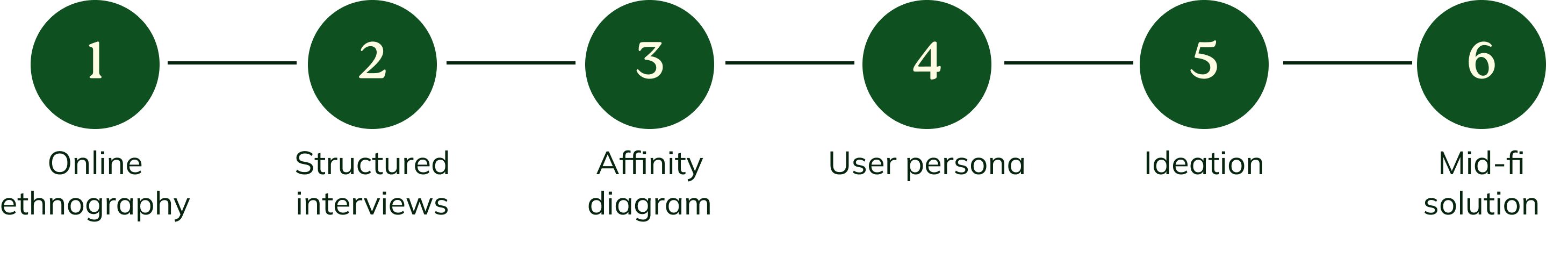
Research
With the clock ticking, we explored the current experience for students.
As the area of student life was quite broad, we decided to narrow down on administrative and enrolment processes from our own university. This was a personal gripe for all of us, and something we were all passionate to address.
Online ethnography
One team member was in charge of conducting an online ethnography on a series of Reddit posts on r/usyd. This comprised of multiple posts from confused students looking for academic planning advice and enrollment assistance.
Structured interviews
I was responsible for developing the interview questions along with another team member. We both conducted one interview each on another USYD student. In order to work as efficiently as possible, some artificial intelligence was used here to assist in refining the script and analysing data.
Affinity diagram
To identify themes across our research, all four of us worked on an affinity diagram, resulting in a clearer picture of the problem:
- The poor UI of uni services disrupts the flow of academic planning
- Lack of effective centralised/streamlined resources & support
- Insufficient guidance in the clarity of understanding degree structures
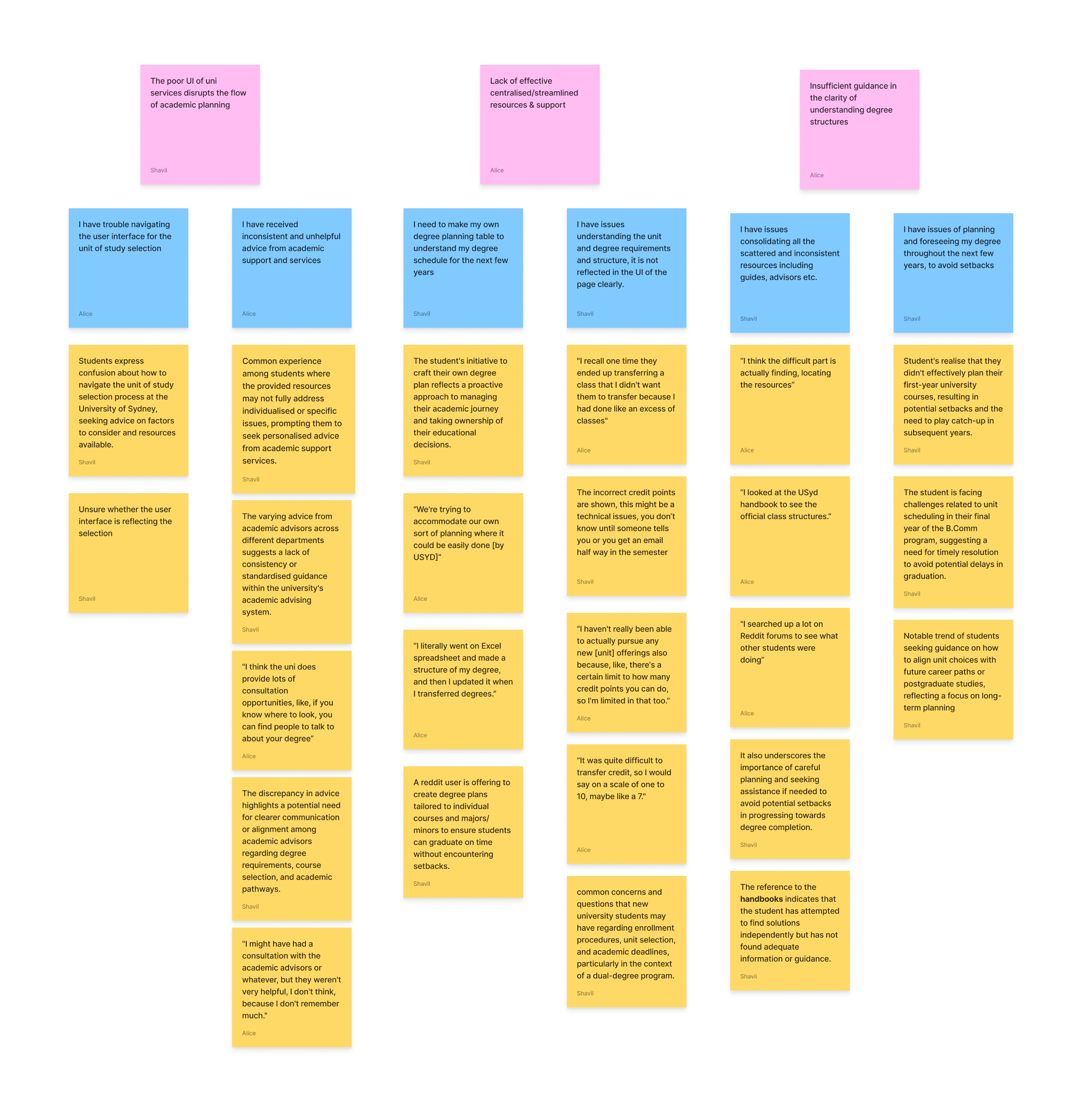
Synthesising insights
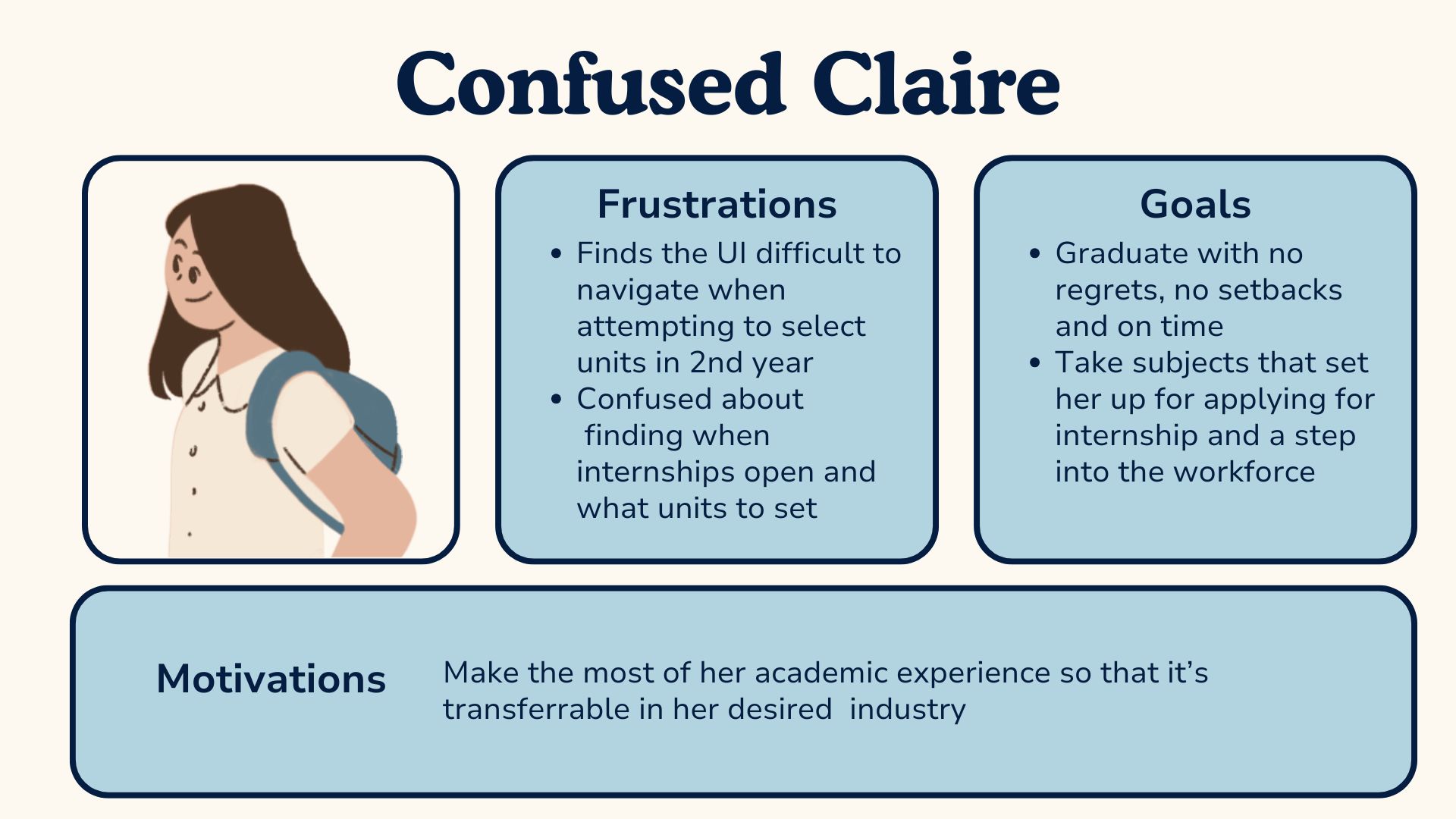
Meet our peer Confused Claire, who represents a large part of our student demographic.
User persona
We created a user persona that symbolised all the insights we derived from our data. Claire has trouble figuring out what are the best units to select, and at what times, in order to benefit her academic and career progression the most. With a desire to graduate on time and secure an internship in her penultimate year, Claire is anxiously motivated to keep herself on track. But how does she even start?
Design audit
The current experience that doesn’t serve Claire:
- Forced to memorise potential units and too tedious & too much scrolling
- Confusing table layout that doesn’t reflect degree planning
- Inability to view selective units at all times, (too many interactions points!)
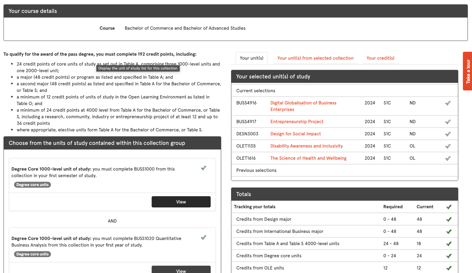
How might we enhance degree planning and unit of study selection for students at USYD desiring better alignment with their academic goals and interests?
Ideation and prototyping
We had fun redesigning the page that caused us students so much frustration.
This part of the process went rapidly as we neared the en of the competition. This involved each of us sketching rough ideas and quickly deciding as a team which ones to start mocking up.
The preliminary ideas:


Final design
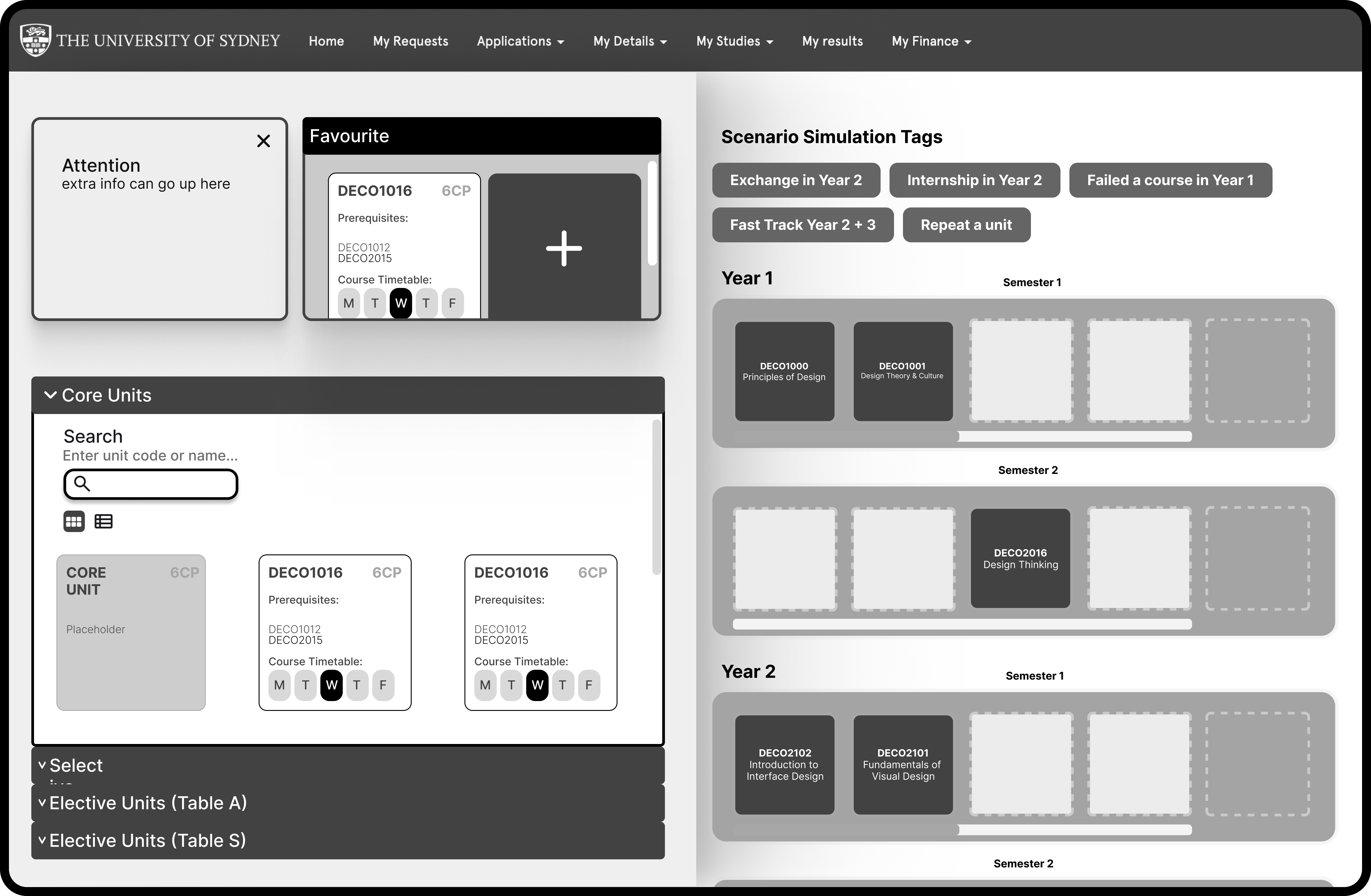
Our winning design focused on customisability and empowering users.
Features
Our redesign maintains the two sections of the existing USYD unit selection page. On the left are the unit options, and the right your selected units.
We’ve introduced the ability to favourite units to eliminate unnecessary scroll time and clicking back and forth.
We’ve also introduced a modular display for the units, though students may still view it as a traditional table. Users are able to drag and drop these unit blocks to the right side of the page.

Reflection
Good design is so important.
That’s a given, of course. However, embarking on this short but rewarding journey really affirmed how much of an impact design solutions that are actually catered to the user can be.
Though this was only a concept and mid-fi design pitched to judges, it was rewarded for its feasibility and unique means of directly addressing students’ pain points.
As a student, it meant a lot to work on a solution that I know could significantly impact so many of my peers.